
Cast your minds back to 2009 to where it all began. Mega-menus were introduced as an alternative to the drop-down, providing enhanced usability for bigger websites which use multiple features and have many categories.
So What are The Benefits?
- The clue is definitely in the name with this one as the mega-menu provides mega-functionality with large panels replacing the drop-down list to reveal groups of navigational options. The navigation choices are structured through layout, typography and imagery to help the user find what they want quickly and easily.
- Mega-menus give your categories room to breathe which allows the user to catch their breath too. Every category is visible at once, doing away with the strenuous scrolling we’ve all come to resent from the drop-down.
- Mega-menus can act as a real reflection of your website’s personality, branding and design. Mega-menus provide an array of options to personalise your menu using fonts, colours and imagery. Visually distinguish categories using headings, typography and imagery to draw attention to key products, categories or a featured offer.
Here are a couple of my favourites:
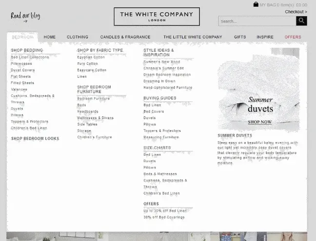
The White Company have really mastered the art of combining categories with content in their easy-to-use mega-menu. Clean and logical, the menu uses a number of clear headings to separate their categories with extra sections dedicated to content relevant to the main category. I’m always banging on about the importance of content in your overall digital marketing strategy and why quality content is important for SEO. Having your content in easy reach helps more customers engage with what you have to say, enhancing your brand identity and establishing yourself as the number one thought leader in your relevant sector.
A big part of content optimisation is to provide useful information which helps with the buying process and having that information as high up in the structural hierarchy as you can. In their mega-menu, The White Company have given their content a starring role and separated their content into the authoritative (informative guides) and the inspirational (design and style related posts) to combine advice with ideas – attacking content from all angles.
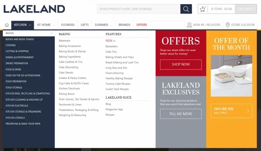
Another great example of a mega-clever mega-menu is Lakeland. A sucker for colour I, like many I would assume, have fallen in love with the bold colour combinations and sleek design which paves the way for a beautiful browsing experience.
Aside from a great design, Lakeland have tackled the increasing number of categories with the introduction of a secondary menu to preserve the clear and coherent layout we have all come to expect. Every website wants to provide a valuable experience for its users and what it really boils down to is creating an SEO friendly site structure that users will love. And users will definitely love how Lakeland have managed to break down their mammoth amount of categories into digestible chunks.
Mega-menus are always evolving to meet the ever-changing demands of customers and google. With the competition for the best mega-menu hotting up in 2016, a fresh focus on clarity, detailed design and a consistent and logical structure are what really drives the look of the many mega-menus we see when we are perusing the web today.
For a closer look at the development of the mega-menu, Econsultancy’s mega-menu design trends in ecommerce: 2014 vs 2016 explores some of the biggest brands on the web and how the design of their mega-menus have changed dramatically in recent years.